Under the supervision of Aureliano Capri and Lorenzo Raffi
My thesis project reflects on design for virtual reality. With “Z-axis”, the title refers to the use of the third axis, the one of the depth, particularly perceived in VR, and with “Manifesto” it declares intent to change approach to design in this field.
Do you want to skip this long explaination and go directly
to the project?
Take me there.
Context
On October 28, 2021, the Facebook Connect took place and Mark Zuckerberg, the CEO of what was then called Facebook, made some very important statements about the future of the internet and how it will be used. Intrigued by this world, I chose to develop something connected to it for my thesis project. After an initial research phase in which I explored the various metaverses that had been developed up to that point, including Zuckerberg's, I began to notice some issues with one of the ways to access it: Virtual Reality.
Problems
The issues in this field are related to a general lack of organization in the available information on the design of virtual worlds, as well as a deficiency in a proper methodology to guide designers who approach this world. To address this problem, I started a second research phase to gain a better understanding of how to proceed, beginning with an analysis of the existing situation.
Analysis
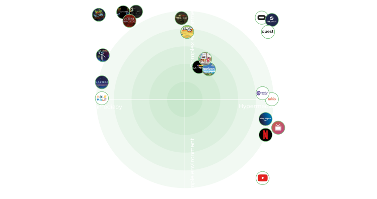
I analyzed the VR design guidelines that had been developed up to that point, specifically those of Mike Alger, UI designer for VR at Google, and Jason Jerald, a prominent figure in VR consultancy. However, I also explored the interfaces that had been developed up to that point, examining them through a framework that helped me understand the complexity of the environments and whether the interfaces were designed with immediacy or hypermediacy in mind.
The aim of this thesis is to create an interface that enhances information consumption through virtual reality, using a methodology that simplifies the design process.
Space subdivision
To achieve this, I first had to study how to distribute information within the space, based on how our body perceives and interacts with the external environment. I divided the space around the user into several zones, depending on the type of interaction required. There is the High Precision Zone, which extends just beyond the Zone of Convenient Reach, a term used in ergonomics to indicate an area around the body where objects and commands can be easily reached. Then there is the Low Precision Zone, which corresponds to the area from one to six meters away from the user. Finally, there is the Passive-Use Zone, an optimal area to reproduce any content that does not require interaction.
Framework
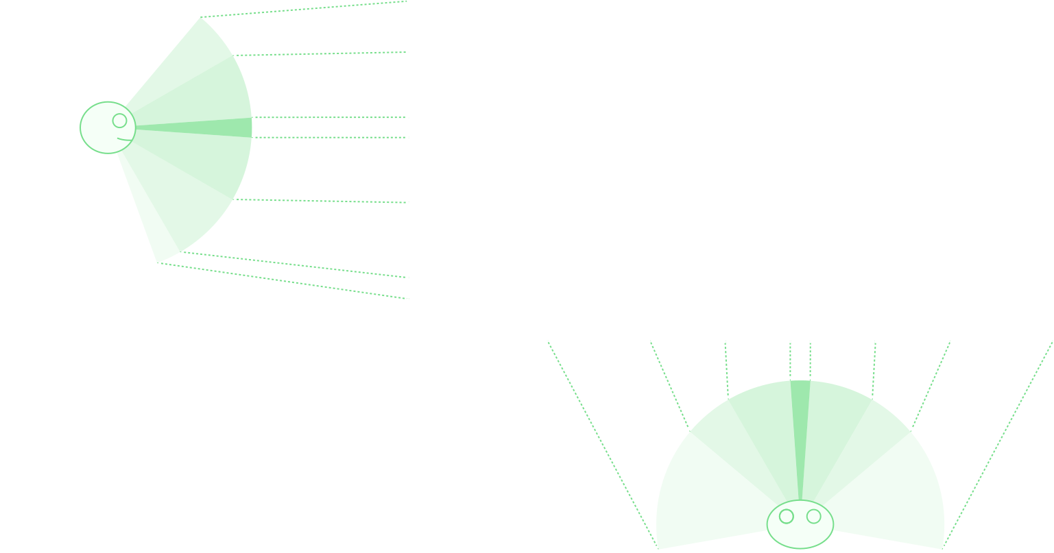
Next, I proceeded to develop a framework that would enable me to preview easily what I intended to bring into VR. I began by studying the subdivision of our visual field, projecting it onto a plane and dividing it in such a way that it would be simple to design. Moreover, this enabled me to think on an angular scale rather than in pixels or meters, thereby providing me with a clear understanding of how much space a specific element occupies on the retina and avoiding dependence on the area occupied within the space.
FOV of the Head Mounted displays
The main problem is that, currently available virtual reality headsets are not able to reach the full extent of our visual field. For example, the most commonly used headset has a field of view (FOV) of just 104° x 98.2°.
Final framework
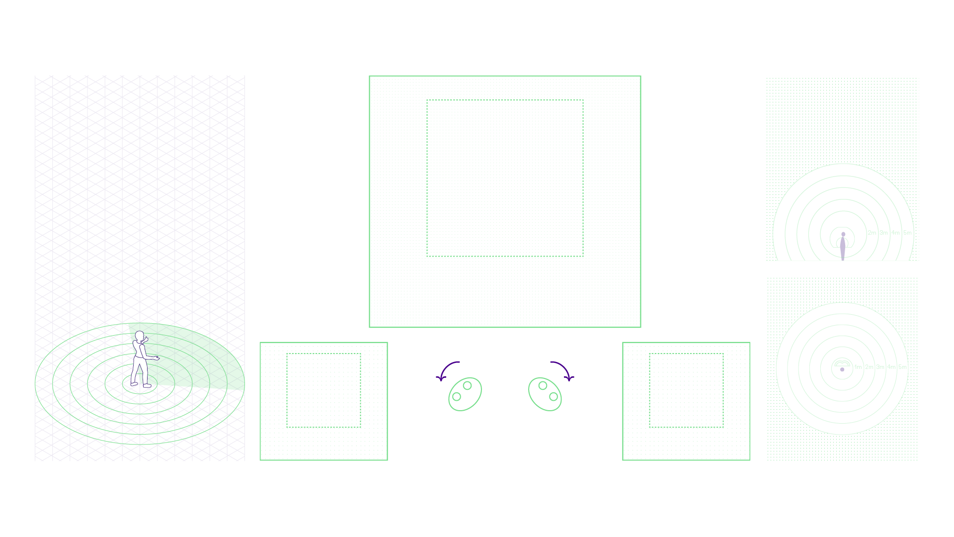
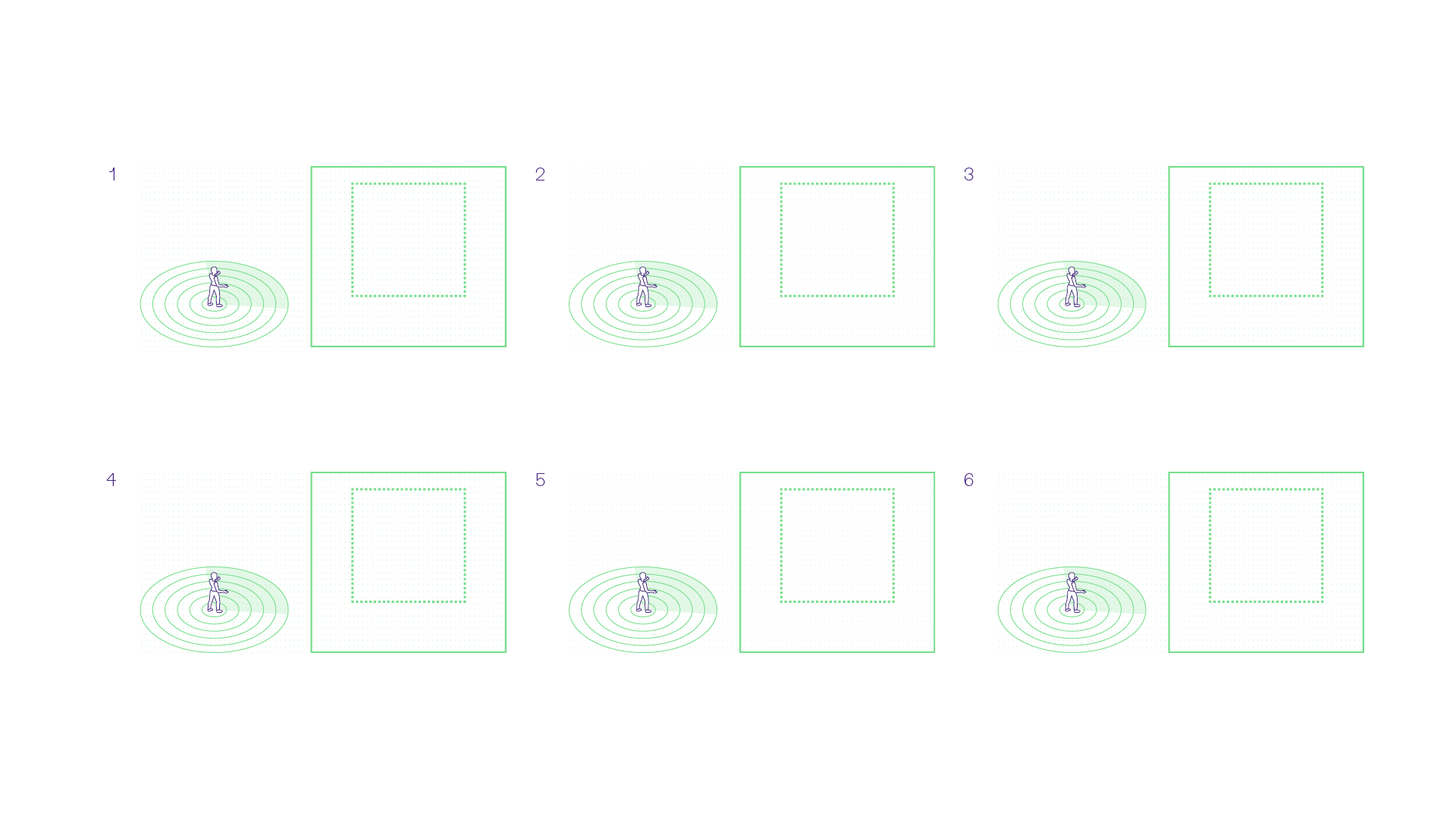
So, I based the complete framework on the latter, adding head rotation, an axonometric part, a top-down view, and a side view to have complete coverage of the space. As I progressed with the previews and sketches, I realized the need to understand how the interfaces would behave over time. Therefore, I added a section for drawing storyboards.
Reading
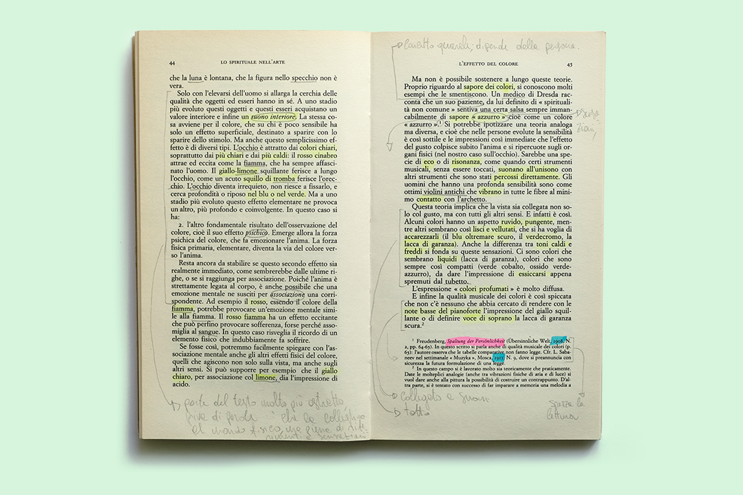
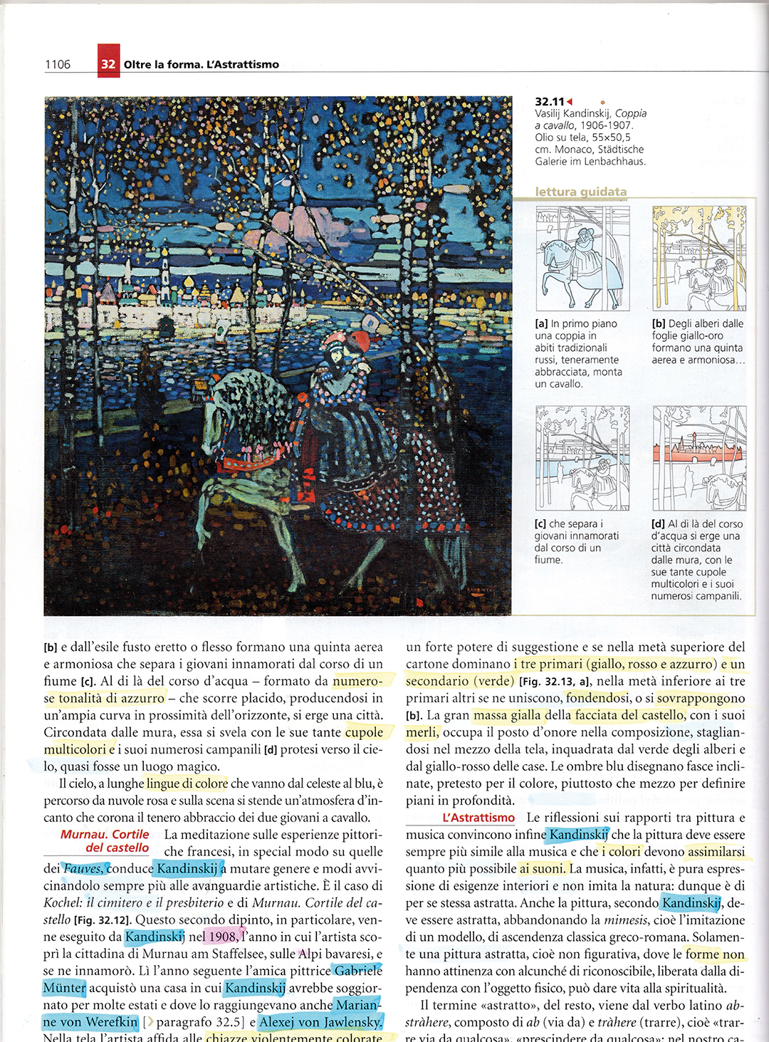
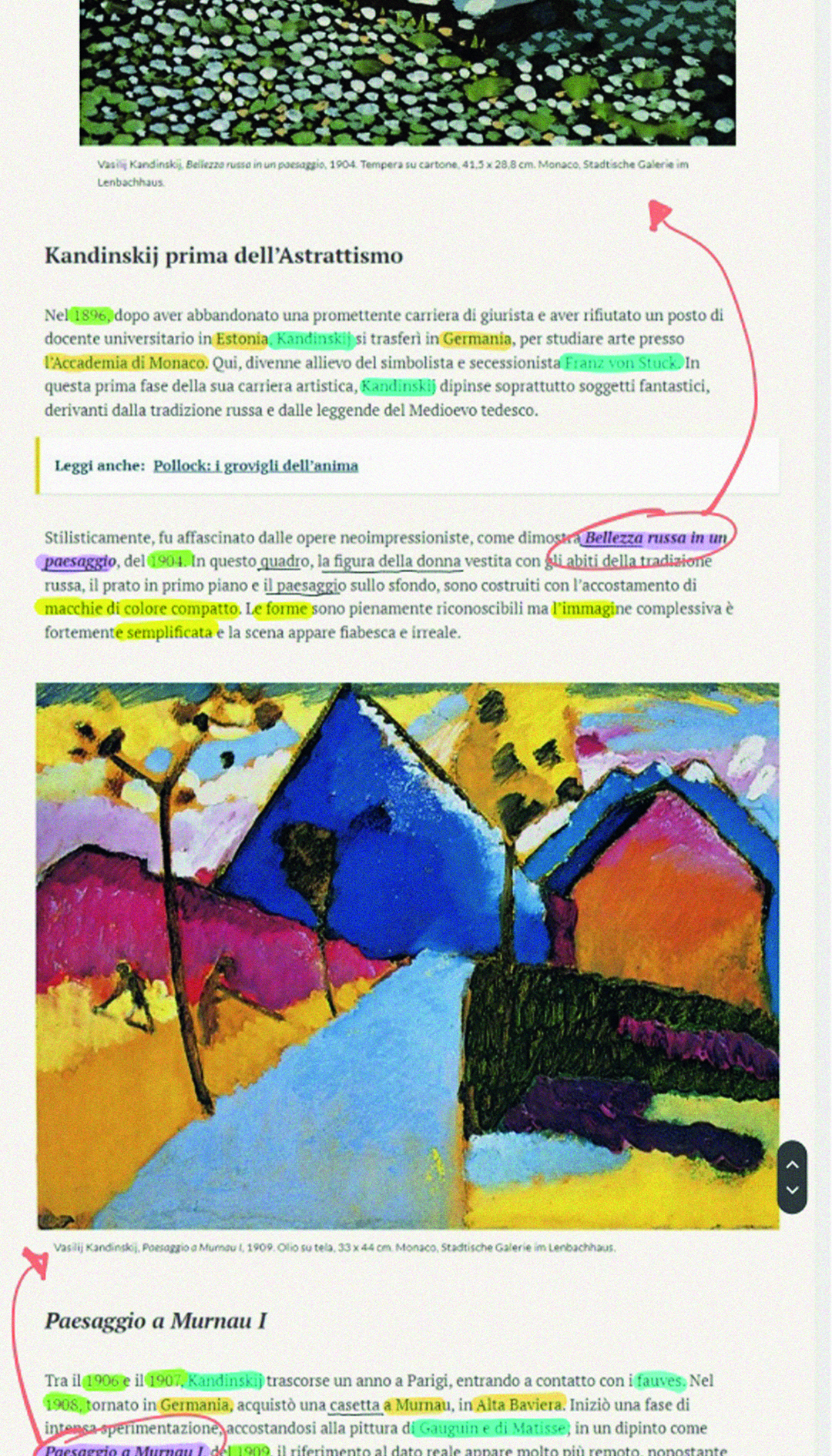
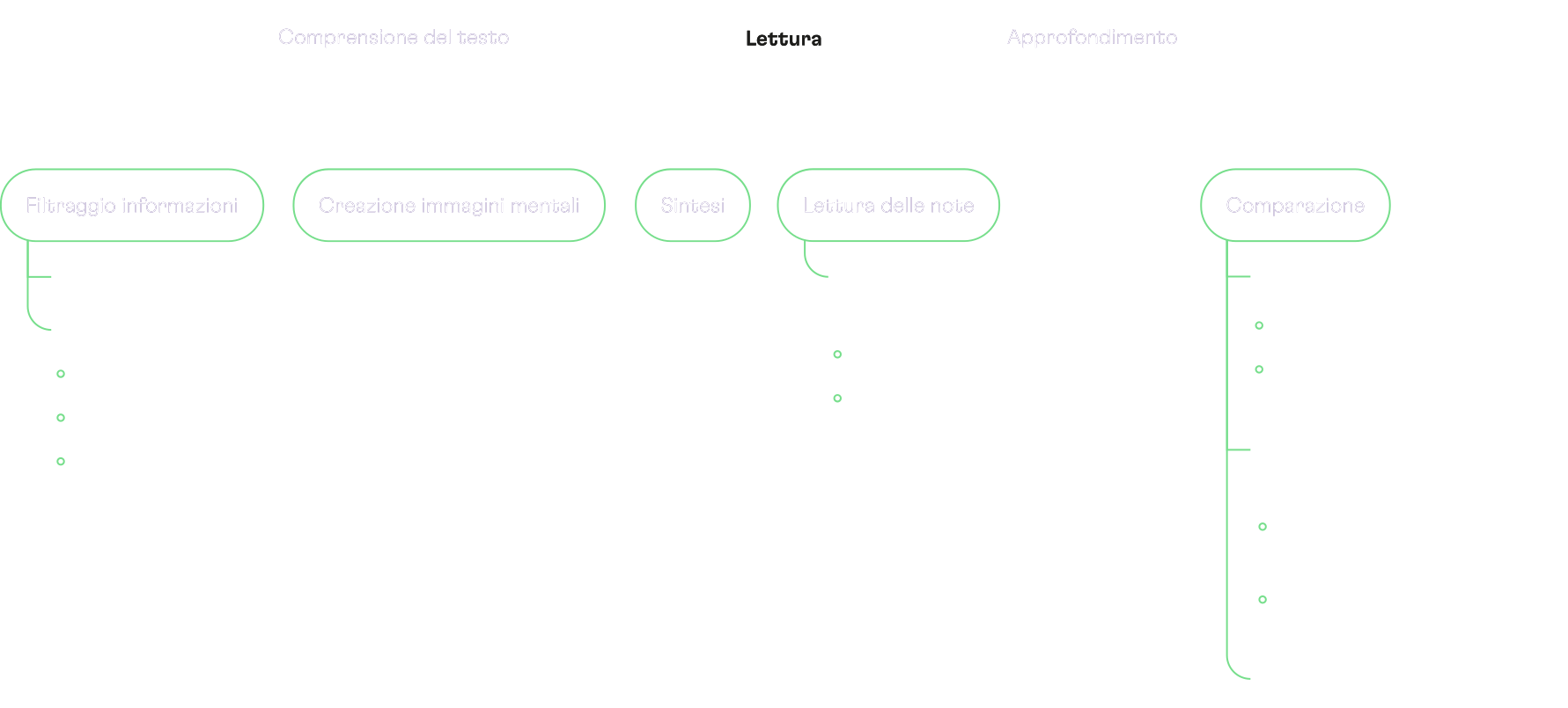
To develop the layout in order to facilitate the reading of information, I had to understand how this information is structured. To do so, I analyzed different types of text. From this, I created reading flows for each type of text analyzed, developing a different path depending on the way the content was presented, and then moved on to creating a general map of information consumption that served as a guide for creating the interface.
Design
Through the use of the developed methodology, I structured the interface and its layout in order to simplify its use in VR. Let's take a look at a brief introductory video.
Area subdivision
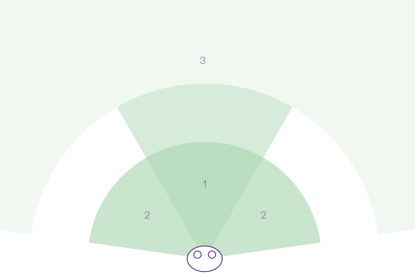
I divided the area sorrounding the user in three parts:
User tests
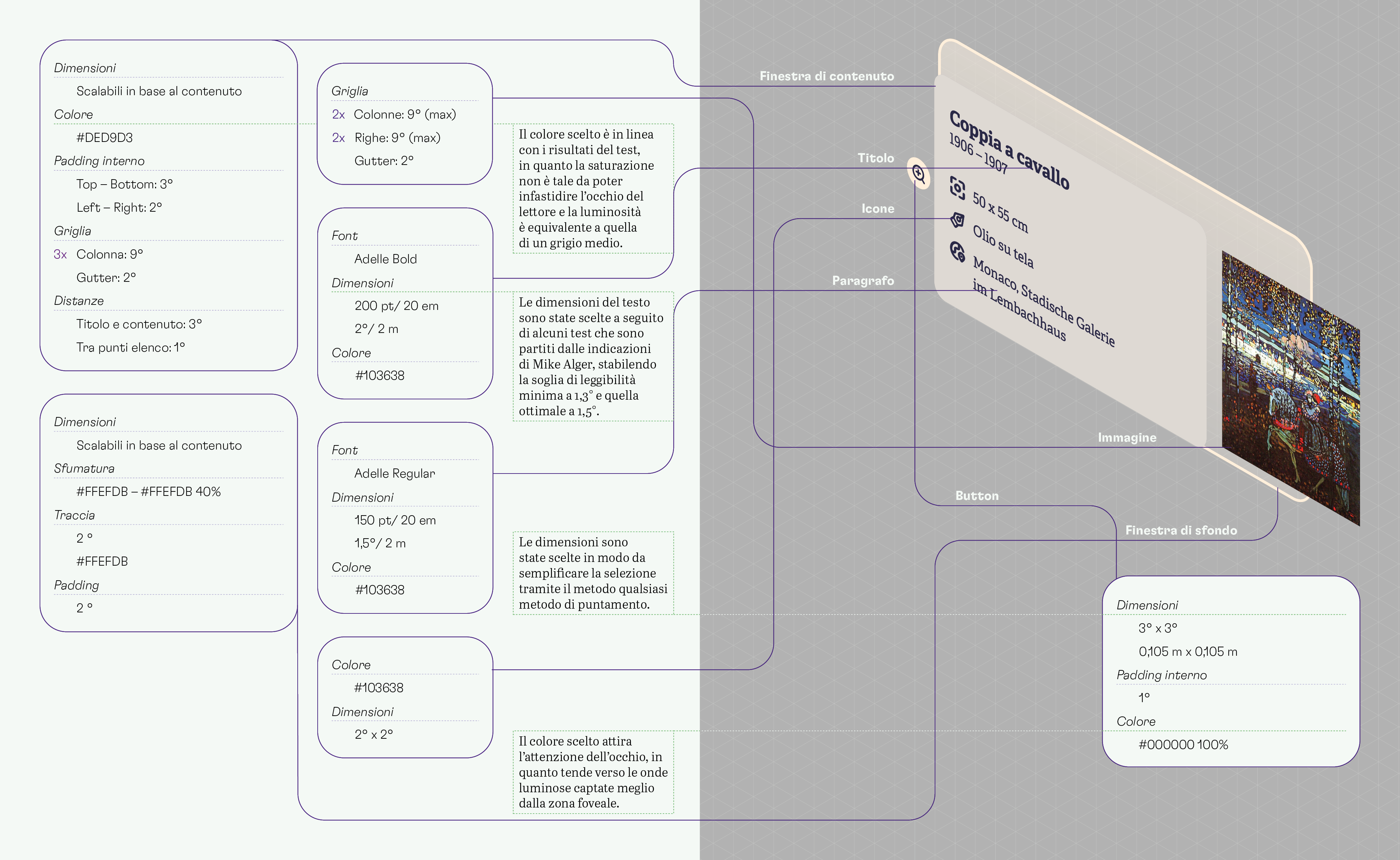
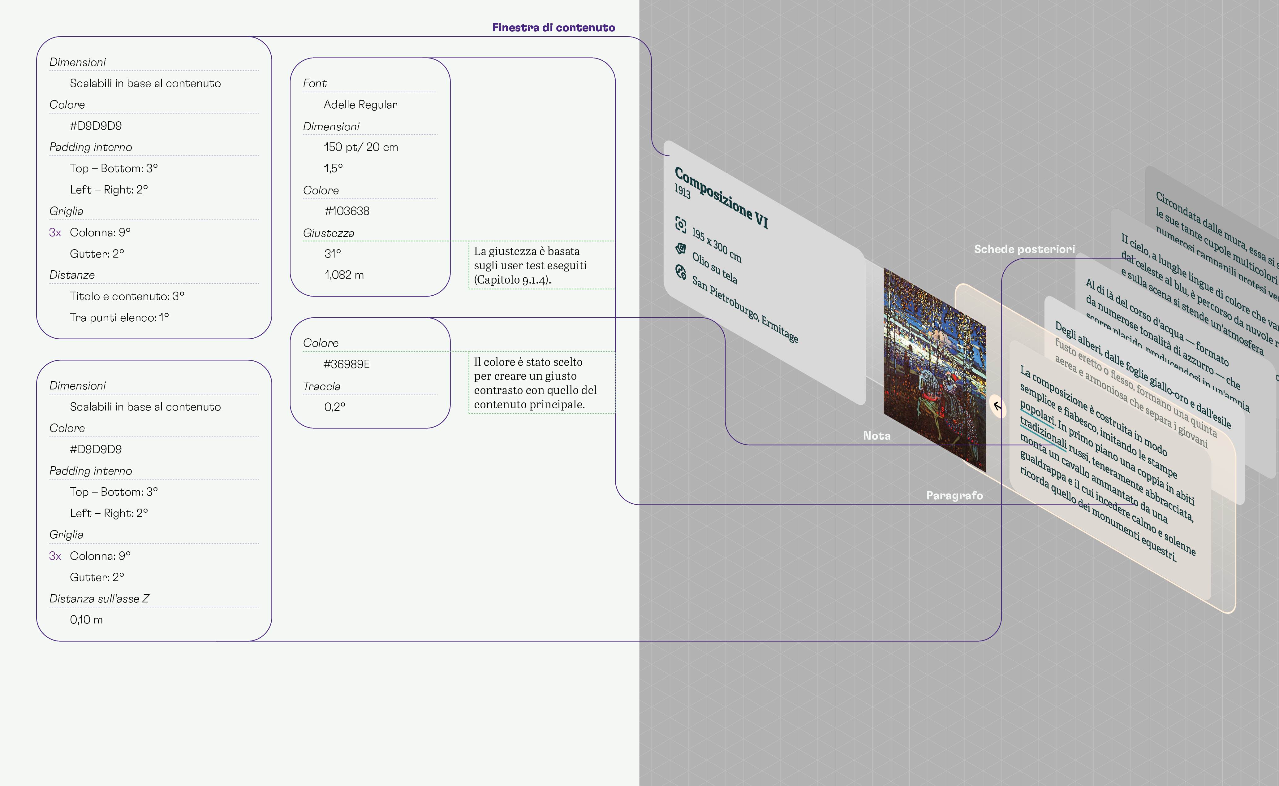
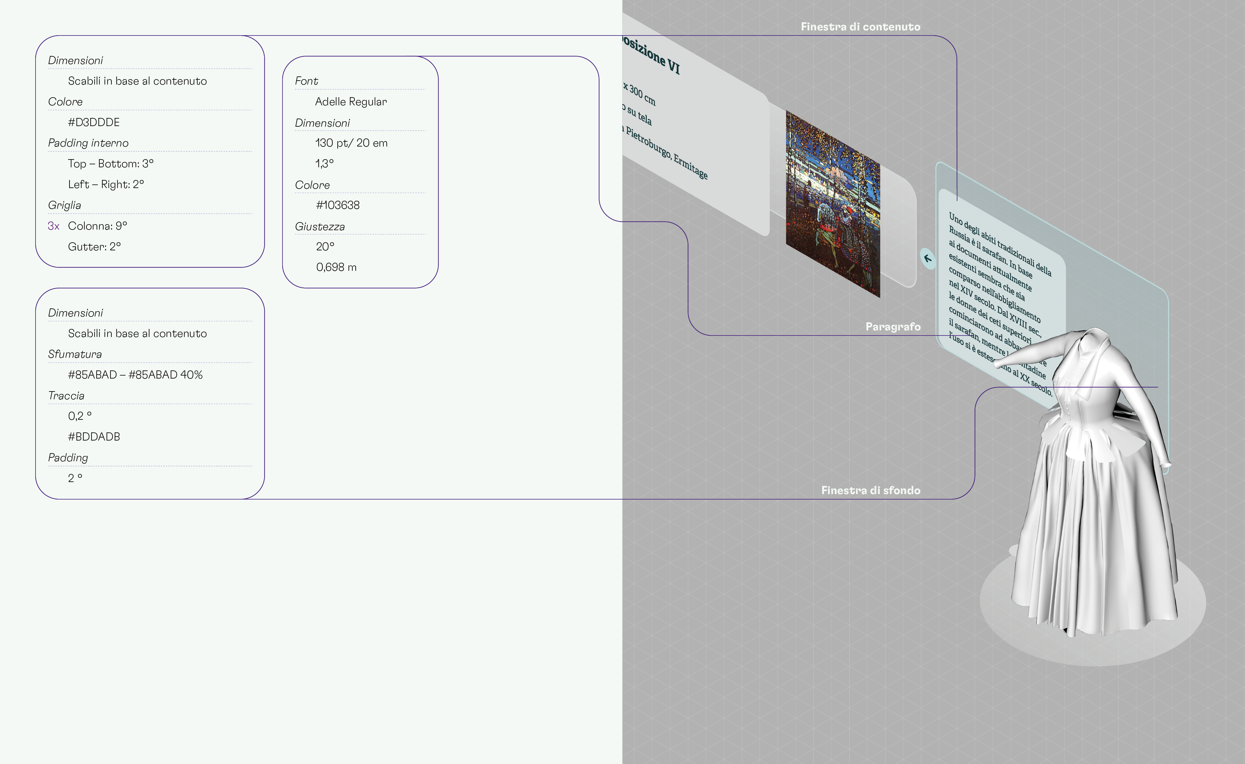
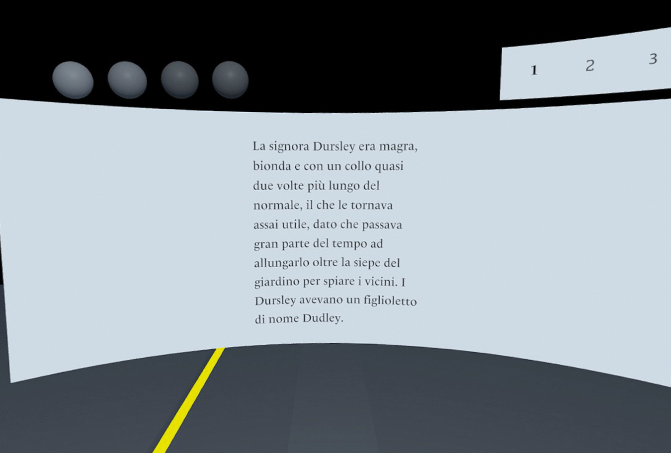
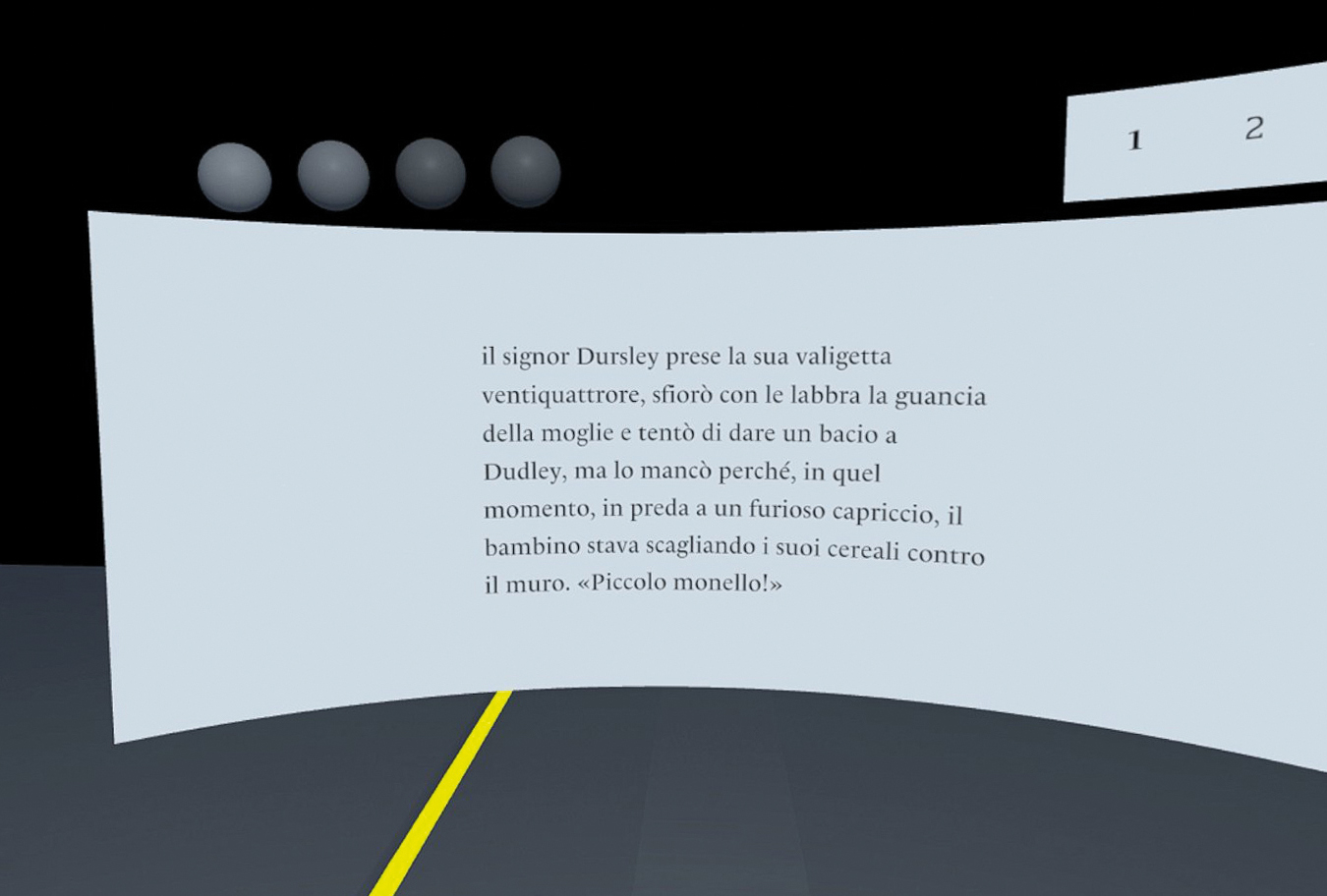
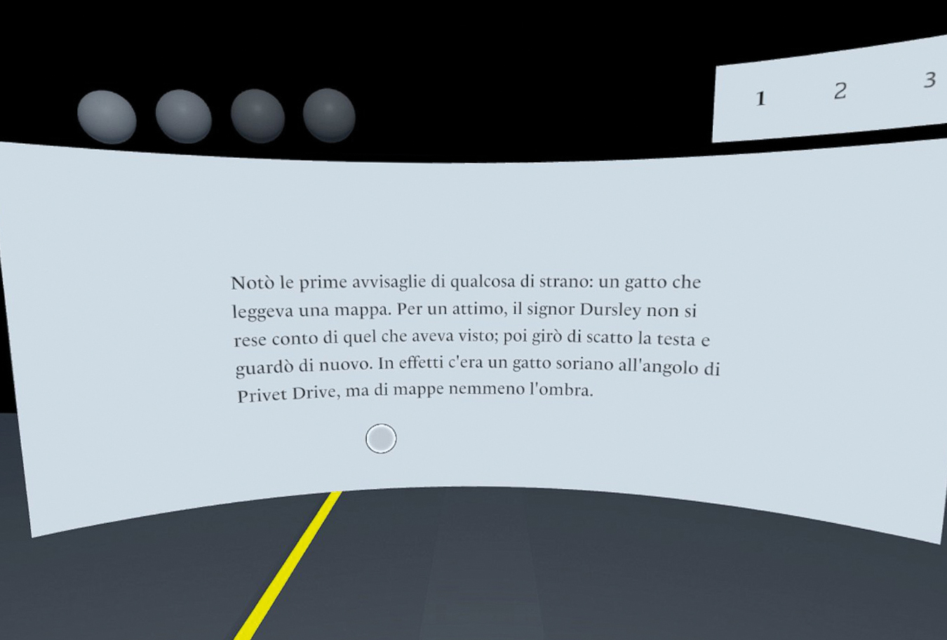
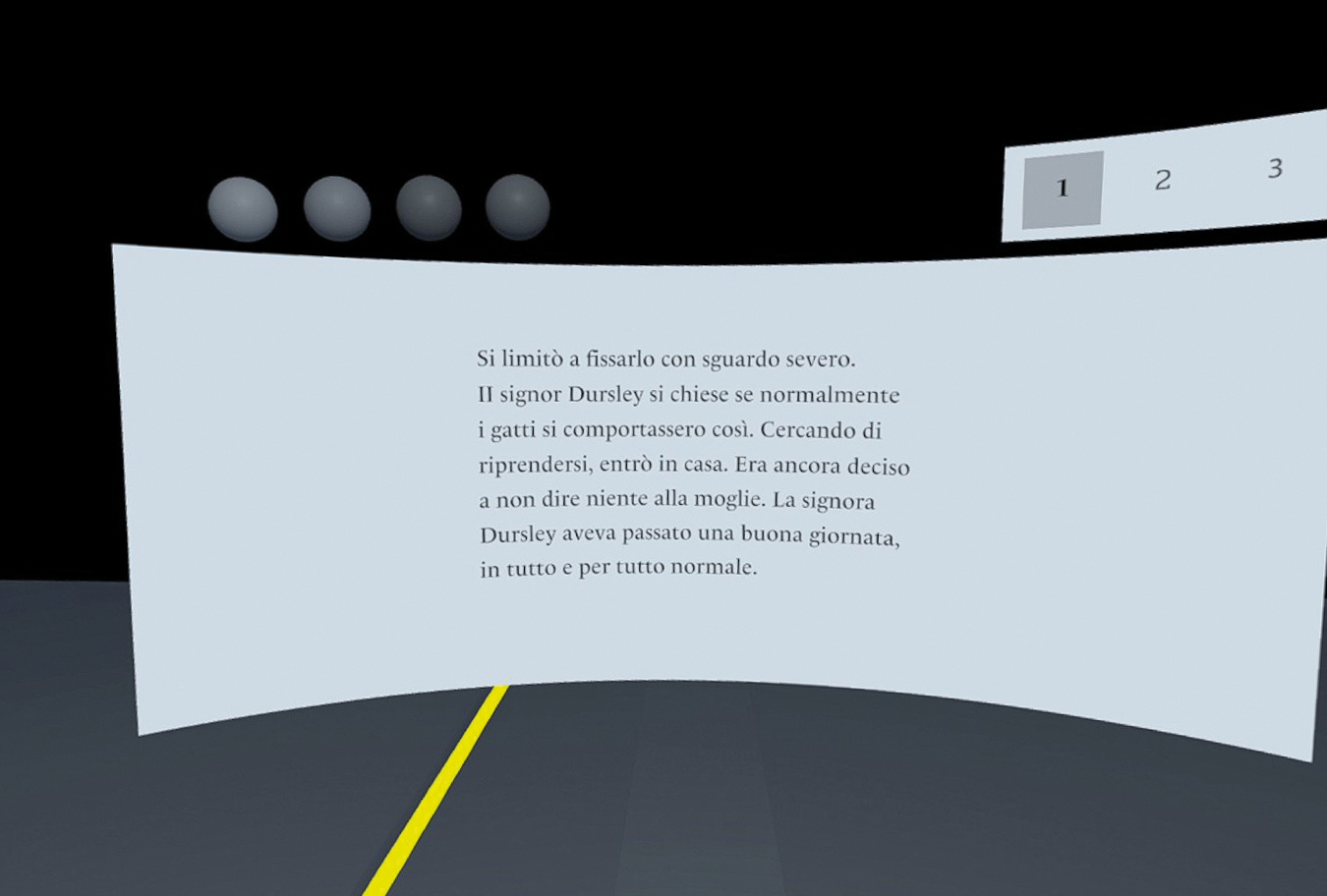
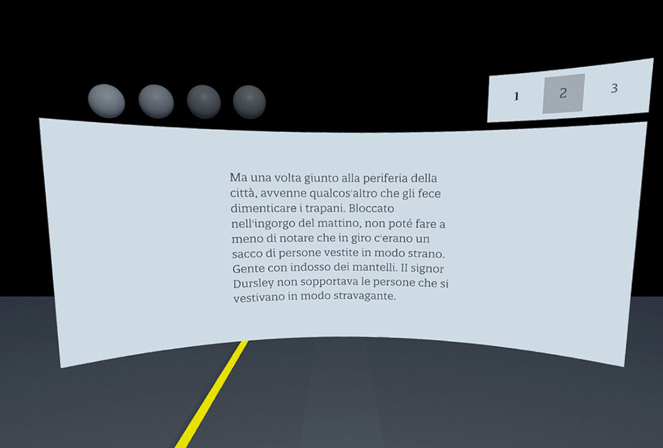
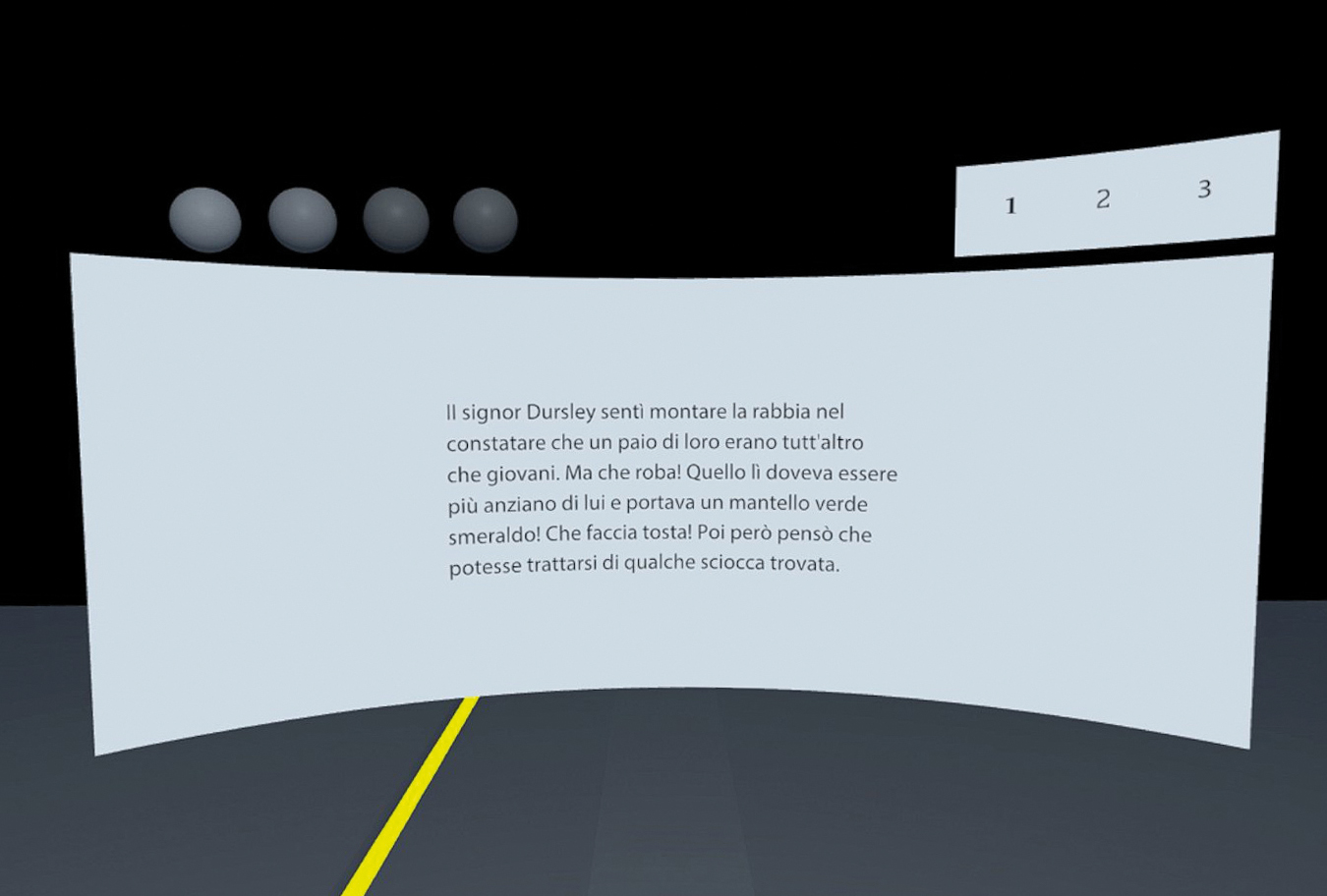
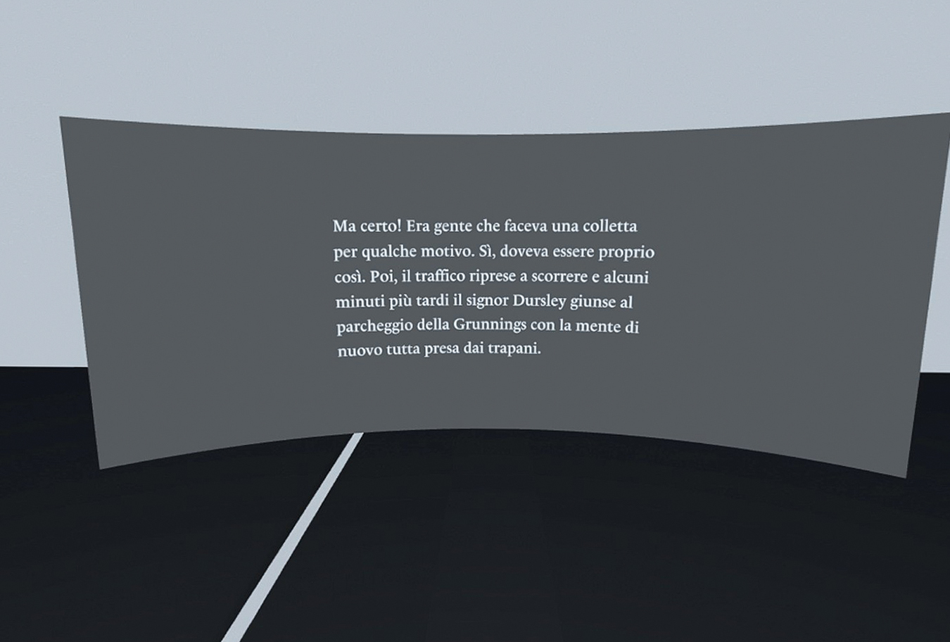
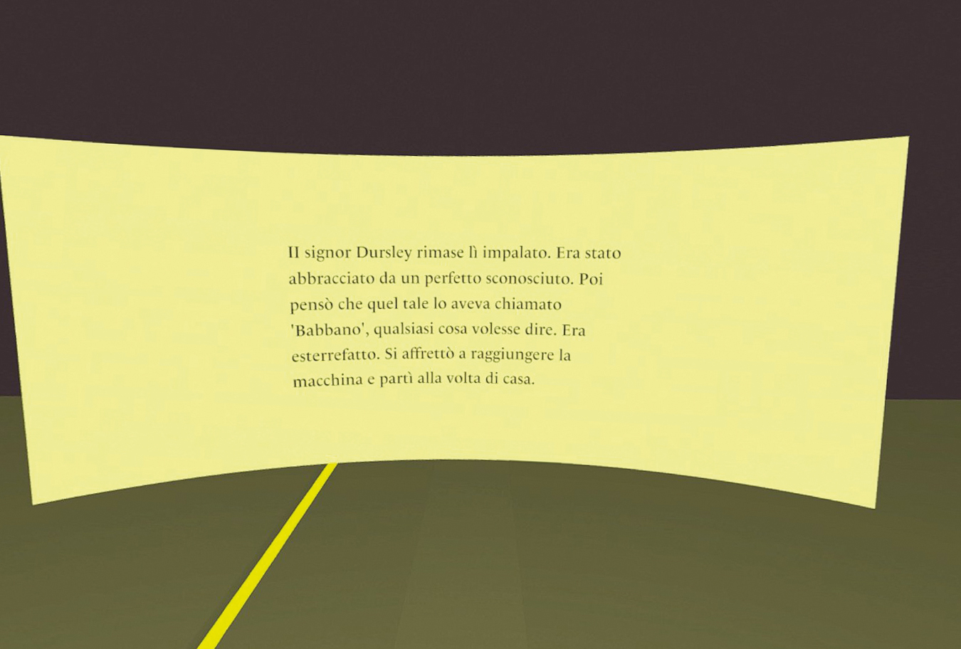
Being an interface reserved for reading information, I needed to further understand the elements that were not touched upon by Jerald or Alger, regarding the characteristics of text. So, I defined a series of tests that helped me objectively understand the best conditions for the following data: typographic length, font type, brightness and colours of the environment and interface. The results of these tests helped me understand that: texts with an accuracy of 20° are the most readable; Egyptian fonts with a very large eye are the best; backgrounds with medium brightness help to read more easily; colours disturb reading.
Typographic length
Font
Brightness
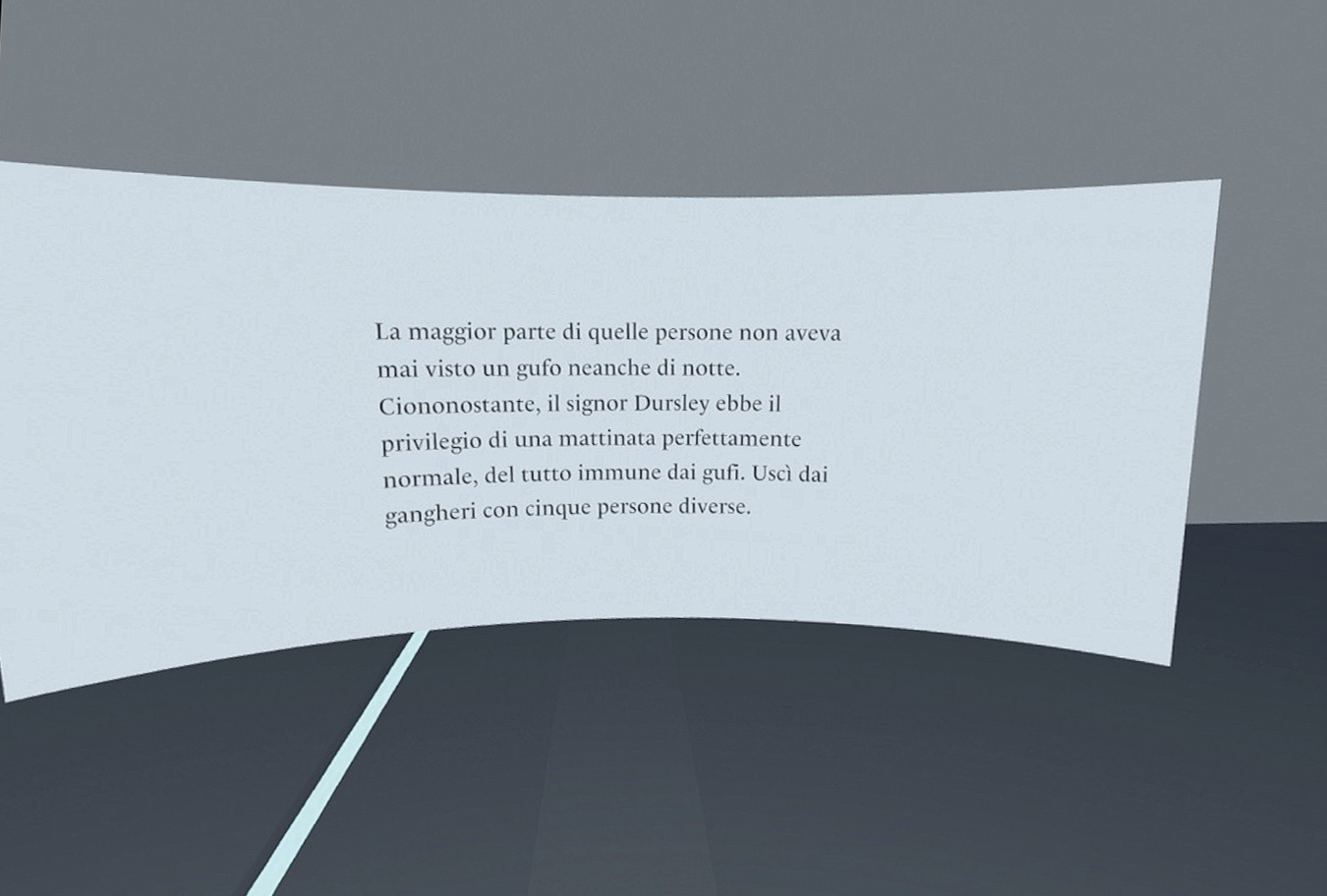
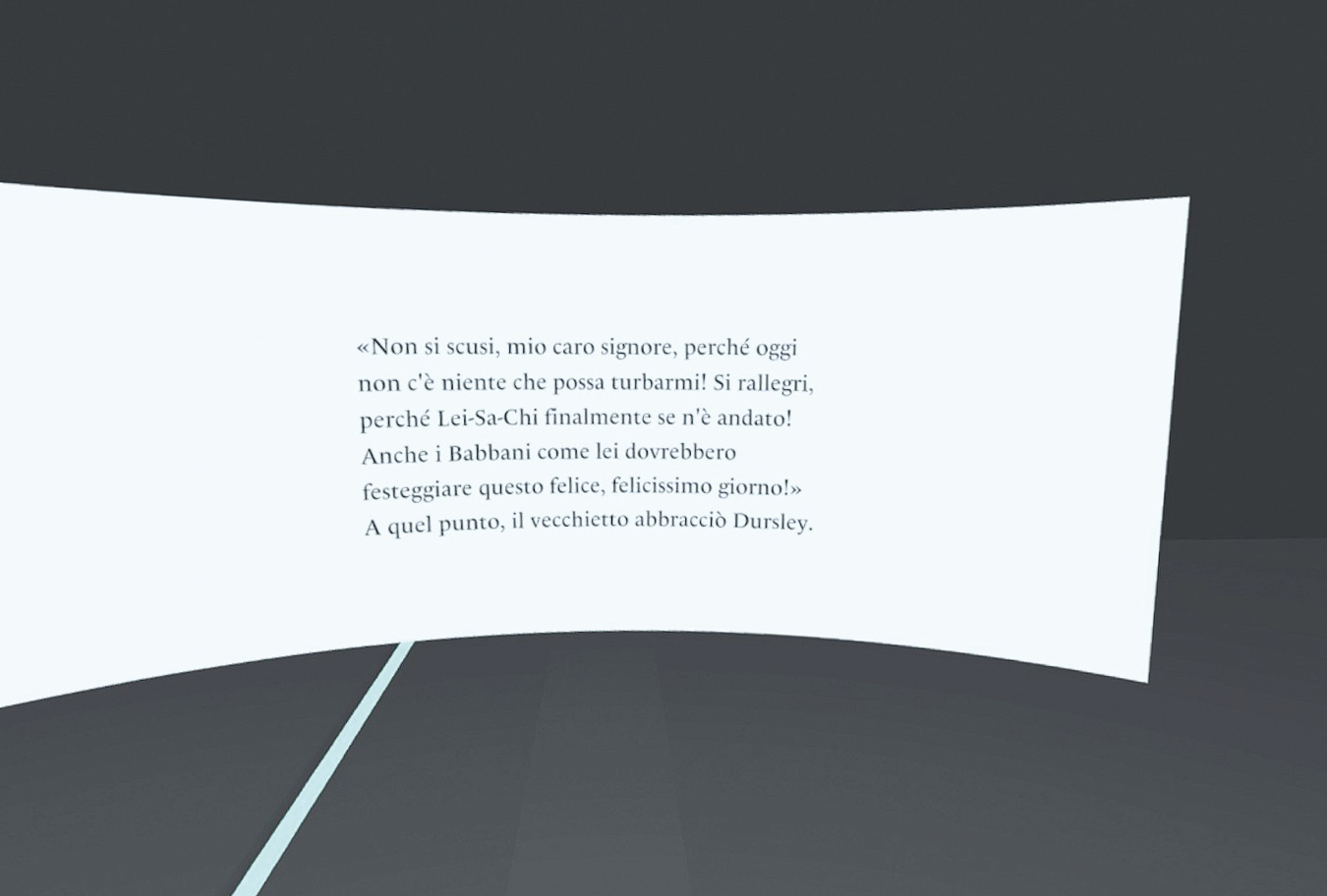
Colours
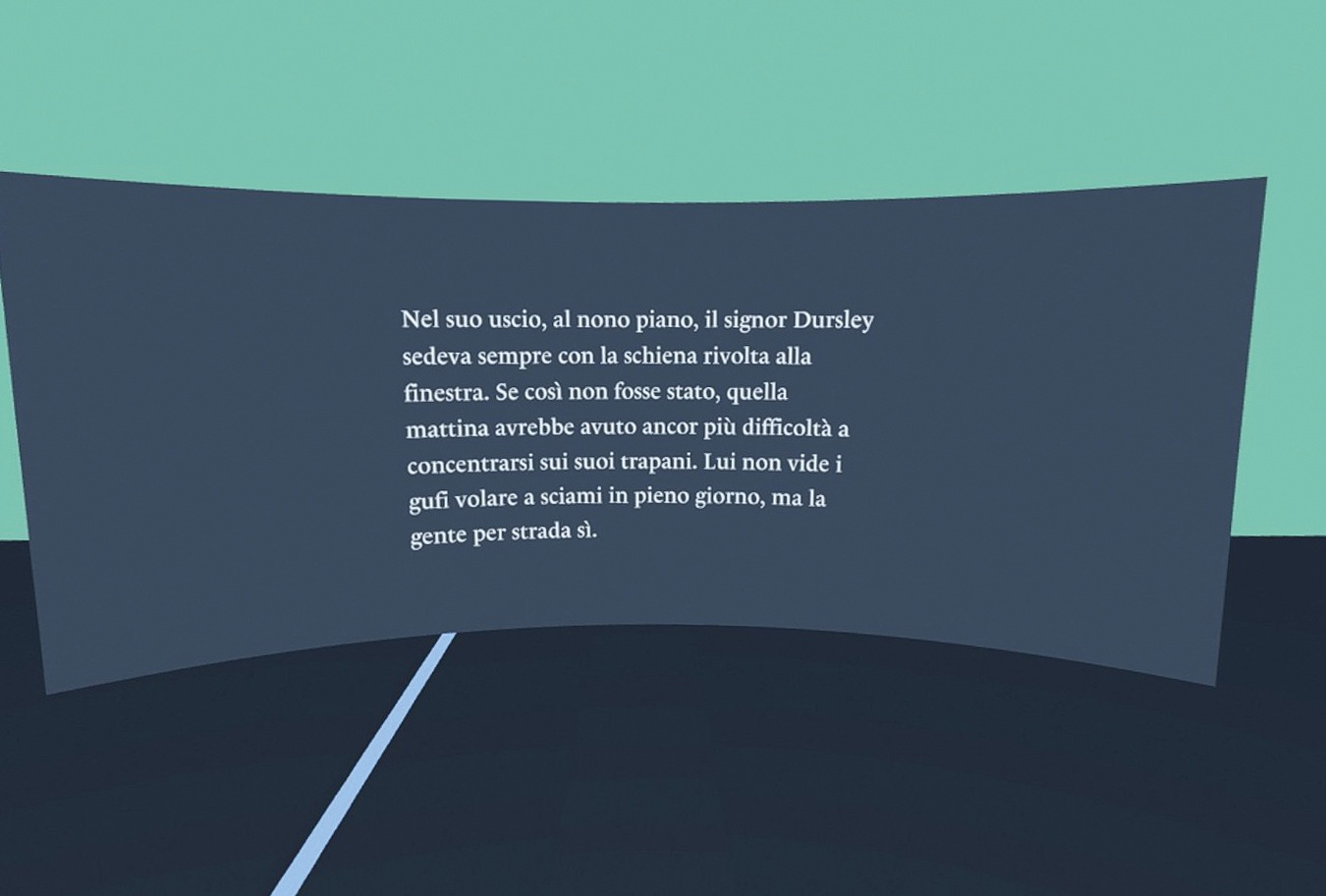
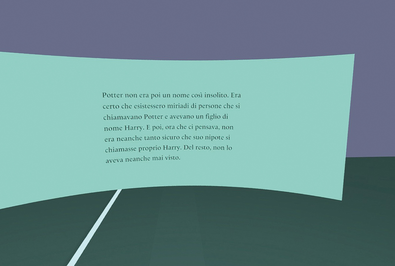
A small calculation
To be as objective as possible in evaluating the quality of reading,
I developed a formula that, combined with the use of some standards,
allowed me to isolate the characteristic I was evaluating,
excluding any difficulties due to the use of texts with
readability levels that were too different or because one
of the texts was longer than the other. The formula in question is:
x = s ÷ (n/i)
where s indicates the seconds that the test participant took to
read the text, n refers to the number of characters present
in the text, and i refers to the Gulpease Index. This allows
me to have a result that serves as an index of reading difficulty.
I then defined two rules for use: the figures should only
be compared to each other in the case of tests that verify
the effectiveness of the same characteristic (i.e.,
the reading difficulty index with 30° accuracy should
be compared with the other accuracy measures); the
figures are not used to rank users, so it is not necessary
to compare the indices obtained by different people, but only
the final result of the test, i.e., which variation of the
characteristics was easier to read.
Interactive floor
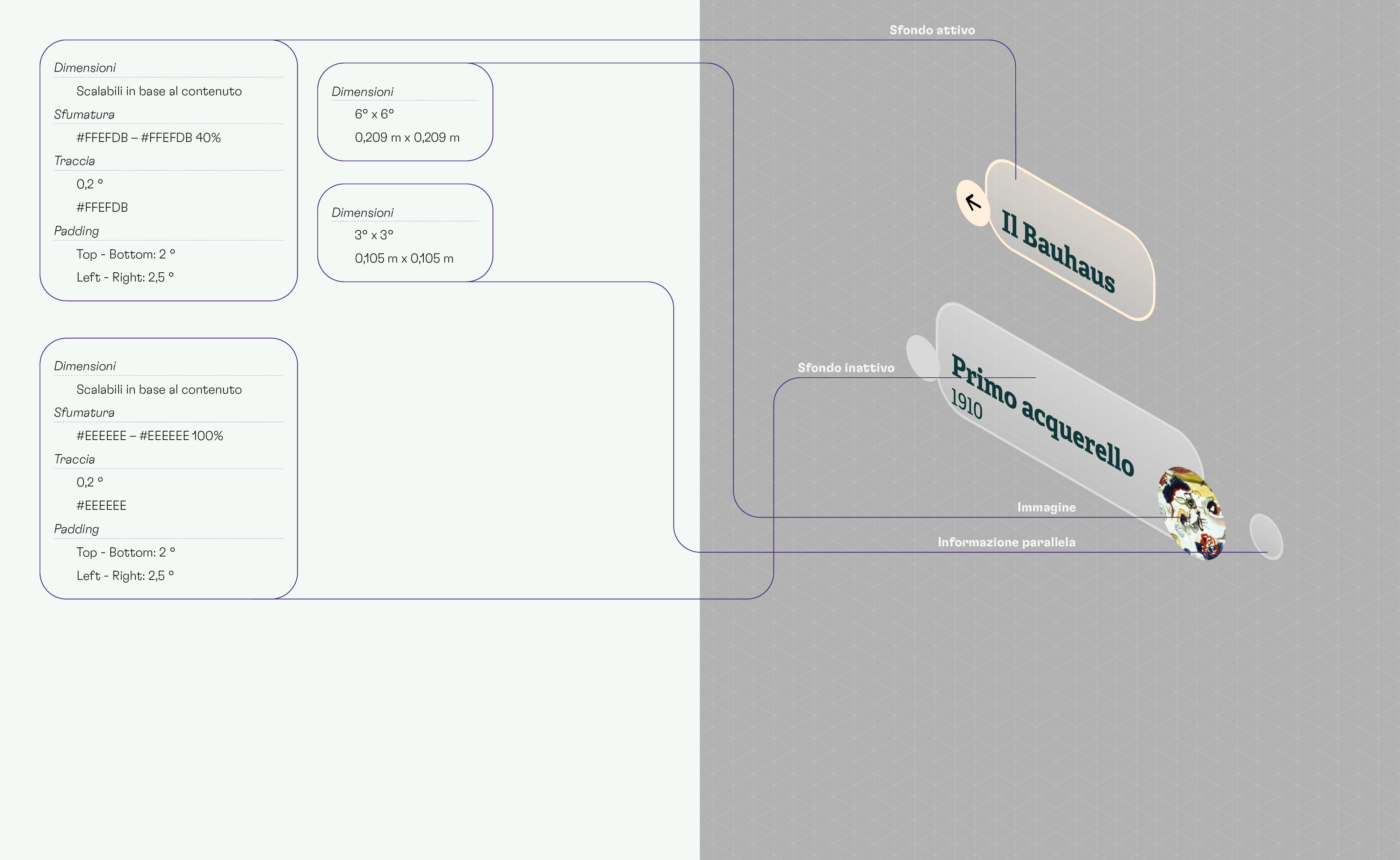
Designed for navigating and communicating the content of the various areas, the floor is interactive and guides the user in the use of the interface, through the use of 4 states:
The rings on the floor indicate to the user where they are at the moment of accessing the content and give them the possibility to go back to the previous topic by pointing towards the corresponding ring. The line that accompanies the active content has a different colour than the rest of the floor. This allows the user to know which area they are consulting.